
To soften the long winter break that divides us from the first tests in February, we decided to bring you a recap of the most interesting datas of the 2017 season, done as usual with exclusive graphs..

In the first graph are reported the gaps in seconds (s) per kilometer in qualifying, of the top five teams (Ferrari, Mercedes, Red Bull, Force India, Williams) including also the much-discussed Mclaren. The trend lines shows the trend of the times of each team, in order to appreciate better the evolutions or regressions occurred during the season.

Looking at the three top teams is immediately evident the incredible positive trend that Red Bull has followed since the beginning of the season, arriving to approach Ferrari in the last races.

Considering Williams, McLaren and Force India, we can note that the last two have followed a strong upward trend during the season, with the surprise of a Mclaren that managed to get close to a very competitive Force India. A confirmation of Mclaren's chassis qualities, always overshadowed by a power unit with well-known problems of reliability.
It's important to underline the regression trend of Williams that brought them from mid-season to be relegated even behind the Mclaren due to a lack of update over the car.

In this chart are shown the best results in qualifying for each team during the season. How we can expect the three top teams show a discreet uniformity of results, with "exploits" only in special occasions as in Monza (very wet track).

The average position graph , which derives from the graph with the results in every Gp is faster to be read.


Similarly here are showed the best race results of each team in every Gp, from which it follows


and the comparison between the average result in the race (red line) and the average in qualifying result (blue bar).


The positions gained by each driver (who took part in the championship) during the first lap of the race.

The total PU components used by each driver on his car.This isan important reliability index.


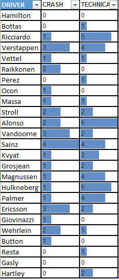
The summary table with the total retirements of all drivers for crashes or for technical issues.

The graph with the evolution of the score in the constructors' championship, with attached a table for more effective consultation of the datas.

The highest mileage runned with all six compounds, with the driver author of the record.
Interestingly the Hard compound has been used only for 74 km compared to the 6261 km made by Perez with the Supersoft. It's easy to understand how rarely the Hard compound has been used and it is natural to ask ourselves whether it was a correct move to introduce for 2018 even a superhard compound.
Interestingly the Hard compound has been used only for 74 km compared to the 6261 km made by Perez with the Supersoft. It's easy to understand how rarely the Hard compound has been used and it is natural to ask ourselves whether it was a correct move to introduce for 2018 even a superhard compound.

Finally, and in conclusion, the annual average of the time taken to make a pit stop from the mechanics of Williams, Ferrari, Mercedes and Red Bull. Even this race in the race has been dominated by Mercedes. Williams also this year is very fast from this point of view, result of a focused work.
Not so well Ferrari which sits in last place among the top three teams.
For the moment is all, see you for the winter tests and always #keepushing !!
By Gianluca Medeot
contribuiting writer Niccolò Arnerich
Nessun commento:
Posta un commento